Our Beginnings
At Warriors & Quiet Waters Foundation (WQW), we believe in the power of nature to heal and transform the lives of post-9/11 combat veterans and their loved ones. Our story began in 2007 with our Solo Fishing Experience – a week-long fly-fishing experience in Southwest Montana – to help veterans cope with the physical, psychological, and moral trauma of combat. Our programming was designed to provide respite, healing, and a safe space for veterans to connect and find belonging with veterans and the volunteers who cared deeply about them.
Over the many years since 2007, the Solo Fishing Experience has done what it was designed to do – help nearly one thousand veterans find healing and hope through fly fishing. It also sparked multiple other veteran programs based on fishing to include a couple’s program, family program, ice-fishing program, and backcountry fly-fishing program.
Experiencing Change
Around 2019, we started noticing that our veteran participants had changed. Upon investigating these changes, we concluded that for most of our new participants, as well as our WQW Alumni, many years had passed since their combat experience or their exit from active duty. In those ensuing years, many of these veterans developed coping mechanisms that enabled them to move beyond the immediate crisis needs that our programs were initially designed to serve.
In 2020, we implemented a new process to measure and evaluate the impact of our programs on our veteran participants with the help of the Institute for Veterans and Military Families at Syracuse University. This improved program evaluation process reinforced what we knew – that our programs were achieving the impact they were designed to have on our veteran participants. We also discovered that several of the outcomes our programming was designed to achieve did not persist for long periods of time after veteran participants returned home.
Our Evolved Mission, Vision, and Program
With this information, the WQW Board of Directors recognized that WQW had the potential to have a greater impact on the lives of post-9/11 combat veterans and their loved ones. The Board’s direction was clear: achieve our organizational potential by maximizing our impact on the Warriors that we serve. With that direction, the WQW Staff and Board got to work. Over the course of the ensuing two years, we crafted a vision for future programming that moves warriors beyond healing from combat-related trauma to thriving in their post-military lives. This is reflected in our updated mission statement that we published over a year ago:
Warriors & Quiet Waters Foundation guides post-9/11 combat veterans and their loved ones to thrive and find peace, meaning, and purpose through fly fishing and other inspirational activities in nature.
With that renewed mission statement, we developed a vision of the impact we wanted to achieve beyond our organization and our programming:
Thriving veterans contribute to thriving communities and that means a better future for all of us.
We then spent 18 months planning and preparing to deploy a new program model that would enable us to achieve our vision. At the outset, we committed to the principle that our new program design would be anchored in best practices and evidence derived from empirically rigorous research on human thriving. We immersed ourselves in peer-reviewed research in the areas of positive psychology, holistic wellness, and the physiological and psychological benefits of pursuing immersive activities, like fly fishing, in nature. We consulted with our veteran alumni, our volunteers, and our donors. We worked with – and in some cases, partnered with – external subject matter experts in these fields.
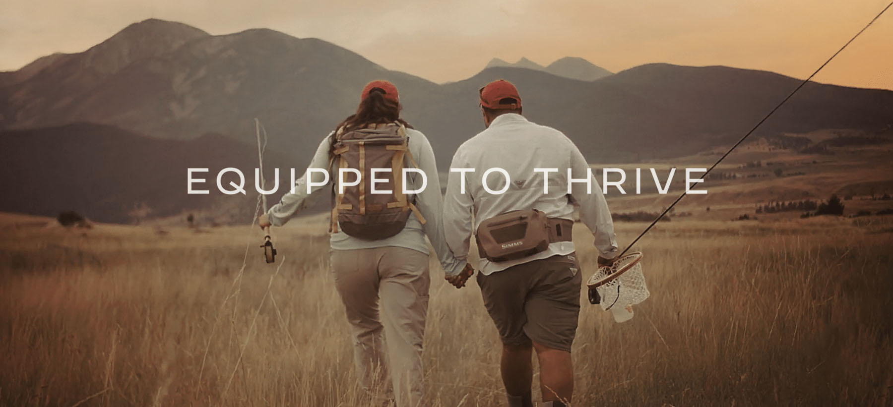
All of this work resulted in two fundamental changes for WQW. The first was our outward recognition that we were not a fly-fishing program. Rather we are a Veteran Services Organization that puts the power of immersive activities in nature – like fly fishing – to work in service of veterans. This gave us the opportunity to put additional immersive activities, like photography and archery elk hunting, to work in enabling veterans to thrive.
The second, and most fundamental change was the development of our new flagship program – Built for More – a one-of-a-kind program designed to equip post-9/11 combat veterans and their loved ones to thrive in every area of life. We believe that our veterans had a huge impact while they served on active duty, but their potential to make an impact didn't end when they left the military – they were built for more.
Built for More immerses participants in peak experiences in nature that enable the psychological, emotional, and social conditions necessary for personal growth. With those conditions established, we guide our participants through a rigorous, evidence-based program that enables them to make meaning of their service, rediscover their identity and potential as veterans, and chart a path of purpose, continuous growth, and resilience.
Peak Experiences in nature leave one with a strong sense of awe, wonder, and gratitude.
Evolving our Brand to fit our Mission
We wouldn’t be what we are today without our founding brand. As our purpose, programming, and strategy evolved, we recognized that our founding brand was no longer positioned to resonate with our core audience, which has and continues to change. What we are today – and what we aspire to be – is different from what our brand once was. Our founding logo lacked a necessary story of our purpose – to help post-9/11 combat veterans thrive. It was very literal to the activity of fly fishing, fueling the perception that we are limited to fly fishing in our scope of services. Moreover, the brand identity needed a more cohesive system, and the brand language needed to connect to our promise of thriving. Our founding colors of purple and gold also didn’t reflect how vital immersion in pristine nature is to fulfilling our mission. Additionally, the color purple, derived from the Purple Heart, fueled the misconception that participants must have a Purple Heart to participate in WQW programming – isolating Warriors from applying who qualified, but lacked the Purple Heart medal.
Recognizing these challenges, we launched a rebranding initiative in 2022 to realign our brand with our evolved approach to veteran programming. We established a committee comprised of Board members, staff, and volunteers to direct and manage the process. We held focus groups of alumni, volunteers, and donors to garner their recommendations and feedback. We engaged a best-in-class branding agency, Tatum Design, to help us create the new brand. Our new brand tells the story of who WQW is now and what we strive to accomplish.
We believe inner strength is best found outdoors. Warriors & Quiet Waters is a purpose-driven community offering nature-based experiences designed to restore the minds, bodies, and souls of post-9/11 combat veterans. Our programs cultivate a safe and supportive environment where veterans can grow, heal, and experience deep camaraderie. Our community’s sole focus is to help each Warrior discover they were built for more. More connection. More peace. More purpose. More life. When Warriors arrive at our ranch, they begin a journey that will last a lifetime. A journey founded on courage that leads to a future built on hope. Transformed, these men and women, and their families, gain renewed confidence in their ability to move forward with resilience and succeed in every area of life.
Change can be hard
We also recognize that change, especially major changes such as this, are hard. We know that it will take time to gain recognition, affinity, and loyalty to this new brand. But we’re ready for that challenge because we recognize that our rebranding also presents Warriors & Quiet Waters a tremendous opportunity to align our brand with our vision, our strategy, and evolved approach to serving veterans. We’re confident that by seeing WQW live up to the promises that our new brand makes, you’ll come to love it like we have.
Brian Gilman
Colonel, USMC (Ret.), Chief Executive Officer
Our new brand will carry us into the future, as it truly represents who we are and what we stand for.
Our new visual identity represents the themes of thriving and growth, nature (water/river), and military symbolism.
The new logo features:
- An eagle that is strong, balanced, centered, rising up, and thriving.
- "Emblematic" of the military and growth.
- The depiction of flowing water, combined the with new brand colors, reflects the palette of the natural settings where WQW programming happens.
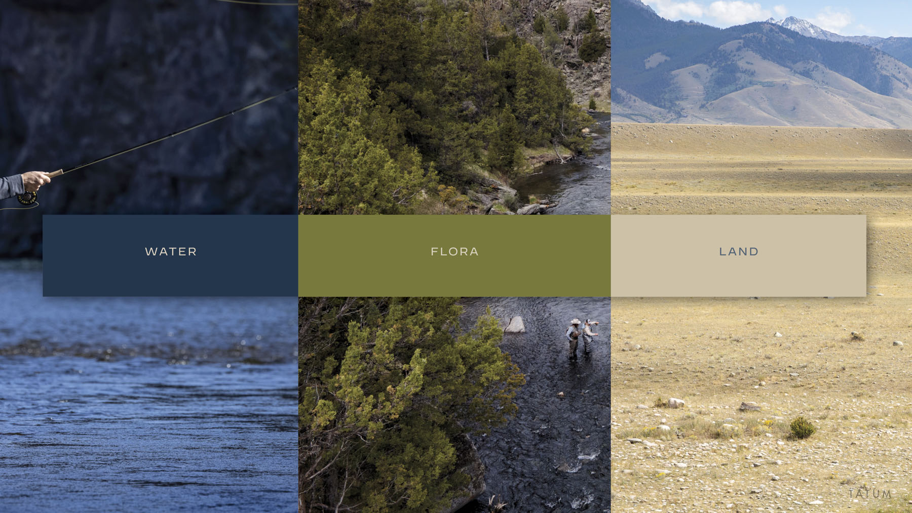
Brand Colors:
Our new brand position and brand promise are clear and succinct in explaining our offering — our promise — to post-9/11 combat veterans and their loved ones:
Our new brand attributes represent the commitment that we make to our veterans, their loved ones, our volunteers, and our donors:
Empowering
Committed
Trustworthy
Resilient
Intentional
Brand Imagery
FAQS
We have Eric's full support - not only of our new brand but in the overall direction of WQW. Read more of what Eric thinks here.
Although our brand logo no longer has the outline of Montana, we remain a Montana organization who conducts the majority of our programs in Montana. We chose to emphasize other priorities in our brand logo - specifically that we serve veterans, that we enable veterans to thrive, and that we do this by immersing veterans in nature. We simply couldn't make the logo itself say everything that needs to be said about WQW. We are emphasizing our Montana heritage by combining our logo with amazing photography of Montana and our brand language.
Something we learned going through this process is that we all bring pre-conceived biases and notions that cause us to see things in our logo that are simply not there. We've heard it compared to insurance company logos, german military symbology and others. If you look at it closely, we believe it most closely imitates the Great Seal of the United States, but that was not our intent either.
The new logo features:
- An eagle that is strong, balanced, centered, rising up, and thriving.
- "Emblematic" of the military and growth.
- The depiction of flowing water, combined the with new brand colors, reflects the palette of the natural settings where WQW programming happens.
Brand Colors:
Green : Flora
Blue : Water
Tan : Land
Merchandise will be available for purchase on the website or in-person at the WQW office after July 12.

